In order to create more insight on sales data, Einstein Analytics can be great help. In order to bring Einstein Analytics into the game, it’s required to create relevant data flows, datasets, dashboards in other words an EA application.
The aim here is to bring a solution for better understanding the relations between profitability/loss at first sight. In order to achieve this goal, daily data collection is important, this means running the data flow everyday and get the ‘exchange rate’, ‘price of the products’, ‘partial and/or total volumes’ and naturally the ‘revenue’ and ‘date’. Basically take a snapshot of the data.
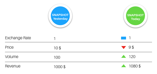
The data flow runs daily and stores the data in a table. The data table grows by addition of new rows. The data table also includes ‘snapshot date’, ‘exchange rate’, ‘price’, ‘volume’ and ‘revenue’ fields as columns.
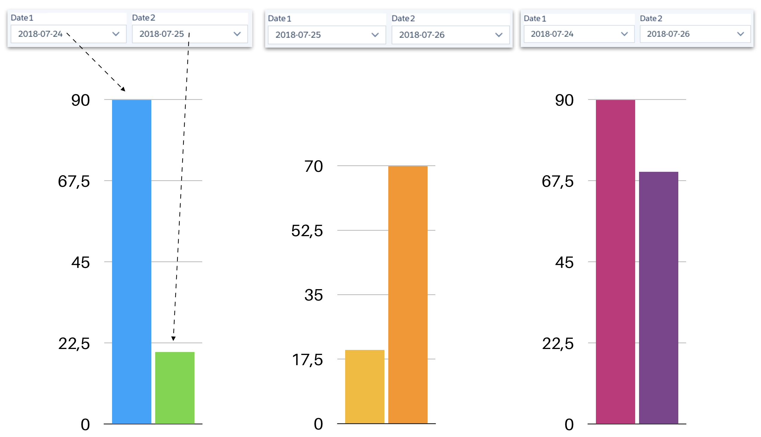
In order to calculate the changes shown in the figure above, you need to use the compare table.
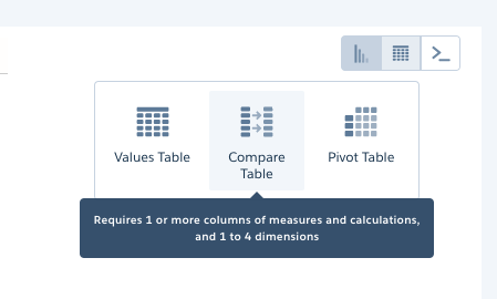
choose ‘compare table’
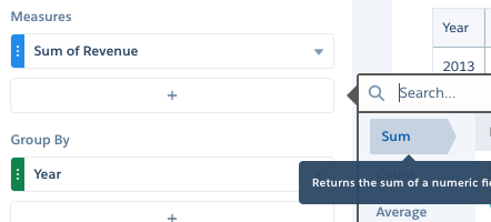
You need to add measures then click on the ‘arrow down’ icon and select ‘Edit this column’ option of a measure to define formulas for the column.
While editing the columns (measures) you can assign new aliases. For example in the use case which is defined here, one can expect two snapshots having two different revenue values and a new column to calculate the ‘change in revenue’. It’s easy to set the alias R1 for ‘snapshot #1’s revenue’ as R2 for ‘snapshot #2’s revenue’. It’s simple! Defining the ‘change in revenue’ requires a new column with a formula calculation of ‘R2-R1’. You can also define window functions for different groups of data.
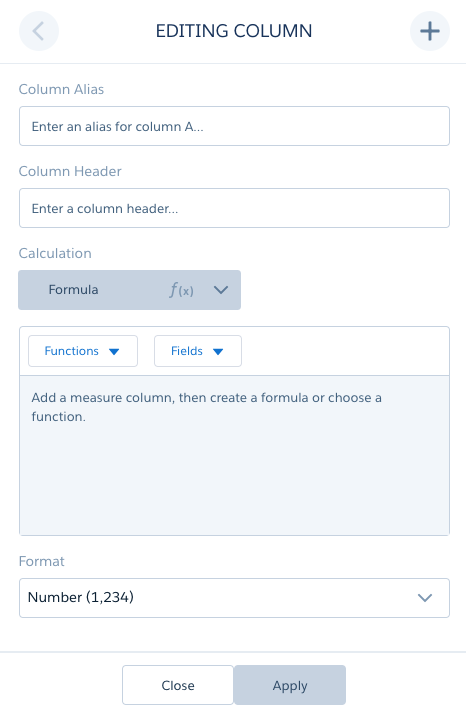
editing the columns of the compare table
Once you have all the columns and their formulas defined, you can save the compare table and transform it into a chart. The calculations are done, dynamically and displayed as bars, slices or as gauges according to your chart choices.
Problem: I guess until this point everything was clear. The problem I was facing with was to define two date fields (as string) ‘Snapshot Date 1’ and ‘Snapshot Date 2’ and filter the data ‘Revenue’, ‘Price’ etc. on selection.
The tricky part was having only one table (dataset). So I defined two columns for date (as string) which are calculated (computeExpression) everyday when the data flow run happens.
When you use one field ‘Snapshot Date 1’ and select a date, because of faceting, every element on the dashboard was filtered. This restricts comparison of two dates.
Overcoming such a problem requires ‘disabling faceting’ on the list selector fields and on the chart and define manual binding of the fields as filters to the steps.
Solution: I basically modified the compare table, disabled the faceting and bound the steps with list selectors in a custom fashion. The bottle neck was the binding filters and the steps.
To do that hit Ctrl+E (windows), Cmd+E (mac) and edit the code as below for each column you want to filter per list selector.
"filters": [
  [
      "SnapshotDate1",
      [
          "{{column(SnapshotDate1ListSelector.selection, [\"SnapshotDate1\"]).asObject()}}"
      ],
      "=="
  ]
]
In order to make the binding happen and filtering work, the real trick was using “==” operator rather than “in”.